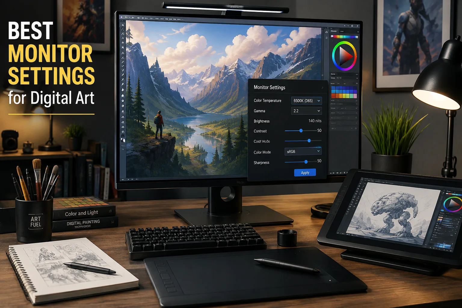
Quick Answer: The best monitor settings for digital art are 6500K (D65) color temperature, Gamma 2.2, sRGB color mode, 120–160 nits brightness, default contrast, and default sharpness. These settings help ensure your artwork appears consistent across monitors, phones, websites, and prints while reducing eye strain during long creative sessions.
Table of Contents
- What Are the Best Monitor Settings for Digital Art?
- Why Monitor Settings Matter
- Recommended Monitor Settings
- How to Calibrate Your Monitor
- Common Mistakes Artists Make
- Frequently Asked Questions
- Final Thoughts
What Are the Best Monitor Settings for Digital Art?
Choosing the best monitor settings for digital art is one of the easiest ways to improve the accuracy of your work. Even the most expensive drawing tablet or graphics software can't compensate for a poorly configured monitor.
If your display is too bright, your artwork may appear too dark on other devices. If your monitor has overly saturated colors, your finished illustration might look dull when viewed by clients or posted online.
Advertisement
Whether you're creating illustrations, concept art, comics, or digital paintings, accurate monitor settings help you make confident creative decisions.
Recommended Monitor Settings
| Setting | Recommended Value | Why It Matters |
|---|---|---|
| Color Temperature | 6500K (D65) | Natural white point |
| Gamma | 2.2 | Industry standard |
| Brightness | 120–160 nits | Prevents artwork from appearing too dark |
| Contrast | Default | Preserves highlight detail |
| Sharpness | Default | Prevents artificial edge enhancement |
| Color Space | sRGB | Best for web and social media |
| HDR | Off while creating artwork | More predictable colors |
Why Monitor Settings Matter
Imagine spending ten hours painting a landscape.
It looks beautiful on your monitor.
Then you upload it to Instagram...
Suddenly the image looks darker.
The sky has a purple tint.
The shadows lost detail.
This is usually caused by poor monitor calibration—not poor artistic ability.
Your monitor is the lens through which you judge every brush stroke, every highlight, and every color decision. If that lens isn't accurate, you'll unknowingly compensate with incorrect edits.
Professional artists understand that color accuracy is just as important as brush technique.
Best Color Temperature for Digital Art
Recommended: 6500K (D65)
6500 Kelvin closely matches natural daylight and is considered the industry standard for digital artwork.
Avoid presets such as:
- Vivid
- Cool
- Dynamic
- Gaming
- Sports
These modes intentionally exaggerate colors to make games and movies appear more exciting, but they reduce color accuracy.
If your monitor includes an sRGB Mode, it's usually the best option for artists creating work for websites, portfolios, and social media.
Best Gamma Setting
Recommended: 2.2
Gamma controls the relationship between shadows, midtones, and highlights.
A gamma that's too low makes images appear washed out.
A gamma that's too high crushes shadow detail.
Nearly every major creative application—including Adobe Photoshop, Adobe Illustrator, Krita, Clip Studio Paint, Corel Painter, and Procreate—expects a Gamma value of 2.2.
Best Brightness
Brightness is probably the most common mistake beginners make.
Many monitors leave the factory set to maximum brightness because it looks impressive in stores.
For digital artwork:
- 100–120 nits works well in darker studios.
- 120–160 nits is ideal for most home offices.
- Slightly higher may be appropriate in bright workspaces.
If your monitor is too bright, you'll naturally create artwork that's too dark because your eyes compensate.
Best Contrast
Most artists should leave contrast close to its factory default.
Increasing contrast too much causes bright highlights to lose detail.
Reducing it too much makes paintings appear flat and lifeless.
Unless you're calibrating with professional hardware, it's usually best not to make large contrast adjustments.
Should You Use HDR?
For creating artwork:
No.
HDR changes brightness and tone mapping, making it difficult to judge colors accurately.
Once your artwork is finished, you can preview it in HDR if your target platform supports it.
Which Color Space Should Artists Use?
For most artists:
sRGB is the best choice.
It matches how artwork is displayed on:
- Websites
- Threads
- X
- Behance
- ArtStation
Adobe RGB can be beneficial if you produce high-quality prints with equipment that supports the wider color gamut.
IPS vs VA vs OLED
If you're shopping for a monitor, here's a quick comparison.
| Panel Type | Best For | Color Accuracy |
|---|---|---|
| IPS | Digital art | ⭐⭐⭐⭐⭐ |
| OLED | Professional creative work | ⭐⭐⭐⭐⭐ |
| VA | General use | ⭐⭐⭐☆☆ |
| TN | Gaming | ⭐⭐☆☆☆ |
IPS remains one of the best choices because of its consistent colors and wide viewing angles.
How to Calibrate Your Monitor
Professional artists often use hardware calibration devices, but beginners can still achieve excellent results using built-in operating system tools.
Windows
- Search for Calibrate Display Color
- Launch the wizard.
- Adjust Gamma.
- Adjust Brightness.
- Adjust Contrast.
- Save your color profile.
macOS
- Open System Settings
- Select Displays
- Open Color
- Run the calibration assistant.
For professionals selling prints or working with clients, devices such as the Calibrite Display series or Datacolor Spyder can create highly accurate color profiles.
Common Mistakes Artists Make
Working at Maximum Brightness
Factory brightness settings are often far too high.
Lowering brightness produces artwork that translates much better across devices.
Using Gaming Mode
Gaming presets prioritize vibrant colors rather than accuracy.
They're excellent for games...
Not for artwork.
Ignoring Room Lighting
Even a perfectly calibrated monitor looks different depending on your environment.
Try to create artwork under consistent lighting whenever possible.
Never Recalibrating
Monitors slowly drift over time.
Professional artists typically recalibrate every month or two.
Why Color Accuracy Matters for Print
If you plan to sell prints, color accuracy becomes even more important.
Prints cannot reproduce extremely bright monitor colors.
Working with an accurately calibrated display helps ensure your printed artwork closely matches what you created on screen.
Related Resources
If you're new to digital illustration, continue with our beginner's guide:
You'll learn:
- Types of digital art
- Essential software
- Drawing tablets
- Beginner workflows
- How to start creating digital artwork
Recommended Products
Frequently Asked Questions
What is the best monitor brightness for digital art?
Most artists should use between 120 and 160 nits, depending on the lighting in their workspace.
Should HDR be enabled while drawing?
No.
HDR changes brightness and contrast, making it more difficult to judge colors accurately while creating artwork.
Is sRGB better than Adobe RGB?
For artwork shared online, yes.
Most websites and social media platforms display images using the sRGB color space.
What monitor panel is best for digital artists?
An IPS panel offers an excellent balance of color accuracy, viewing angles, and affordability, making it one of the best choices for most digital artists.
Do I need a hardware calibrator?
Not necessarily.
Many beginners can achieve very good results using the calibration tools included with Windows or macOS.
Professional artists who sell prints or work with clients will benefit from a dedicated calibration device.
Final Thoughts
The best monitor settings for digital art won't instantly make you a better artist—but they will ensure the colors, lighting, and details you carefully create are the same ones your audience sees.
Accurate monitor settings reduce guesswork, improve consistency across devices, and help your artwork look professional whether it's viewed online or printed.
Combined with a quality drawing tablet, the right software, and regular practice, a properly calibrated monitor is one of the most valuable tools in any digital artist's workflow.